Showing posts with label sketchbook. Show all posts

Friday, 16 March 2012

Crow flight cycle reference and planning

Following on from Jazzy's bold attempts to stalk crows with a camera and capture them landing, I've been looking at how we might be able to animate the scene where the crow swoops in and lands on the scarecrow's arm as painlessly as possible.

By an astonishing coincidence I found this rather interesting video on Youtube:


I find the whole situation hilariously ironic - it's almost exactly the sort of movement we want and it's done in After Effects with an almost puppety looking bird. Of course, owing to the simplicity of the shape the animator was able to get a good deal more flexibility in his bird - note the flexing and arching of the back - it would be significantly more difficult to achieve with our puppet. I would imagine that he used a vector shape or mask of some sort within After Effects and was able to bend and flex the shapes at will. It's an interesting technique and certainly not one I would have considered. I could be totally wrong, of course - he may have done something totally different. I may actually ask him how he did it, mostly out of curiousity, but it may also be beneficial to us and give us some kind of insight as to how we can better approach this scene.

Regardless, it's a useful video to clearly examine the motion of the bird's landing.


From some quick doodles scribbled in Liz's lecture today (don't worry, I was paying attention!) I started looking at how the body would rotate as the crow comes into land, wondering if we might be able to simply use the same body and rotate it, or whether it would be necessary to draw new ones. Happily it seems we'll be able to re-use it. She'd lift her feet and spread her wings wide as she comes in, flapping to keep balance. We could probably use the same wings as well - they wouldn't necessarily change shape or perspective, simply rotate them along with the body.


I think we'd probably need about three "frames" for the wings - an 'up' pose, a 'down' pose and a 'mid' pose. As with the previous bird tests I did, we could probably rotate the wings down on the Z axis and then switch them to the 'mid' position once they get far enough. Hold that for a few frames, then they come down. They'd be blurred, too, I imagine - so that should cover up any choppy 'cuts' between each position!

If the wings are divided up into two or three sections, say, we could even try to get a bit of overlap by delaying the ends of the wings as she flaps up and down.

Thursday, 15 March 2012

Puppet pose planning and reference

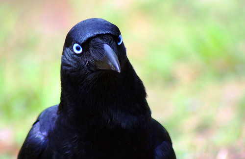
Starting to develop more puppets and thinking about how best to articulate each one. It's much trickier than you'd think; despite the crow's relatively simple design there are a lot of body parts to consider. I've been trying to think economically in terms of re-using as many pieces as possible whilst still maintaining lively and expressive poses and overall quality of animation.


I started with a fairly simple pose from a scene that doesn't require a great deal of movement in the crow — right at the end, when she's perched on the scarecrow, holding the bug in her beak. If done correctly, this pose could potentially be re-used for the scene where she actually lunges forward and grabs the bug from his hat as well. 

It looks totally awful at the moment — it's those blinking wings. I have a basic understanding of their overall structure and mechanics, but trying to rotate them and picture the folding from such a weird angle is incredibly difficult. The one at the top would probably work but I just really wasn't happy with it. The angle isn't quite right, really — the scene in question is more of an over-the-shoulder shot, whereas that one's a little more side-on. It could be used for the bug-grabbing scene, however! 

On the top left is the sketch from the 'above' puppet I posted previously. Nothing to say there.


It was pretty hopeless trying to completely imagine how the wings might fold so I compiled a bunch of beautiful reference images pilfered from Flickr! I opted to grab pictures of regular birds as well as crows — partially because there weren't many images of crows from the angle I wanted. The one on the far-right of the middle row is probably the most useful for my purposes, so it's the one I focused on most.


From the references I was able to scribble something that made a bit more sense — it took me a few tries and it's still far from perfect. I was using a poor-quality printout, however, and it was pretty difficult to see too much detail to reference. I started having real trouble with the head at this point — I tried hiding more of the beak behind the head to better suggest the angle but it just looked a bit peculiar. I think I finally sort-of got it though?

I'm not going to worry too much about the detail of the sketch at this point. It's really just to provide a base to work from — it will be much easier to correct all the horrible mistakes digitally.

I also started thinking a bit more about the wings and flight cycle at this point and how we might go about animating that with nothing but puppets as painlessly as possible.


As before, I started digitally sketching the base of the puppet in Photoshop. The reference on-screen was much clearer and easier to see so it was much easier to get the angle of the wings correct.


I also replaced the original head with one of the others that I had drawn, which fit the angle of the body much better. 


Once the sketch was complete I started going over it again with the pen tool, creating blocky shapes on each layer for each relevant body part. In retrospect it probably wasn't necessary as the crow isn't going to really move at all, but I figure it's always a good move to have articulated puppets ready just in case.

I had a bit of an issue with the outlines - the normal method of simply "stroking" each section wasn't really going to work in this instance - the way I'd divided up the limbs looked a bit weird when stroked like that. The shapes were a bit clunky and awkward. I would have had to alter a lot of the outlines by hand to make it work, so I opted to just draw them myself. It allowed me to keep a lot of the original detail - I think (hope?!) it looks a bit better this way:


Thinking a little further about the more complex sections of the animation, I started trying to figure out how we might look at doing the crow's run for the hang glider chase scene. In theory, it shouldn't be causing too much problem, as it's mostly actually already animated within the animatic. The difficulty, for me, is knowing how far to take it and how to make it fit within the puppet design. 


The animatic version is a simple two-frame cycle of the crow's legs simply going up and down. There's a bit of keyframing to move her up and down and side to side as she runs. Something like this could probably work reasonably well within the final animation, however I wasn't sure whether or not I should look to making the cycle a little more polished and actually animate the legs properly. One thing I'd considered doing was to have maybe three frames for the feet - one flat on the ground, the other being lifted up, and the other outstretched in front. I thought we could maybe take a simple leg shape and rotate it in 3D space along the Z axis to appear as if it was rotating upwards, lying flat towards the camera, to give the impression that she was lifting her leg. As the leg rotated the "lifted" foot could be used, switching to the "outstretched" foot when her leg is fully extended.

I'd really need to put an example together - it's a bit tricky to explain...!


I've started loosely sketching out a potential puppet, trying to figure out how to not make it look utterly ridiculous. Front angles are tricky at any rate, let alone for bloody birds... No matter what I do her face always looks stupid


I was referring heavily to the crow Jazzy drew for the animatic - it's pretty perfect, I've just got to try and adapt it into the style of the crow puppet.


I really don't know about the beak or anything about the face. I think the top of the beak... the bridge-y nostril bit possibly needs to be wider? The expression looks off. She doesn't look particularly scared. It just doesn't have the charm or humour or simplicity of the original, I just don't know how to make it work. I'm not sure if my leg idea will work either - still, best to try eh?


The last thing I started looking at were wings! Specifically, their application to the scene where the crow leaps into the air and runs from the hang glider. The animatic shows her leaping in shock, looking behind her before turning and bolting. This sounds like it would require a great deal of additional puppets, but I've been thinking about it a bit and I reckon it might be possible to get away with just one, using a couple of additional heads and wings for the jump. The body and legs could be recycled from the side-on run (which is going to be very similar to the walking puppet). We could probably just lift her legs and feet (as shown in the terrible doodles at the top there) and attach a new head and set of wings.

We could potentially animate her wings very similarly to how I did the flying crows - we could use one or two basic wing shapes and simply keyframe them up and down at high speed, then apply a heavy motion blur so all you get is a blurred shape flailing about. Maybe we could even kick her legs and shake her tail a bit!

The question of how to fold her wings back up for when she starts running is a bit trickier. We could probably get away with just adding a blurred mid-pose as she draws them back to her body - the whole movement will be very quick so I think we can get away with being pretty loose with it.

I'll have to do some tests to see whether it will work or not. Hopefully it will!

Saturday, 25 February 2012

Crow model sheet V2, 1st draft


Another draft of the crow's potential model sheet. I'm a little bit iffy about trying to draw a model sheet when I still don't feel entirely familiar with her body shape, so I think I might just return to doing some more sketches before I start trying to put one together. I'm mostly okay with the side view, and I'm almost alright with the front view (now that I've figured out that blasted beak) but the 3/4 view is still giving me hell. She looks really off-balance and I'm not keen on the head either.

This is by no means finalised and I'm going to go back and correct tons of anatomy/proportional mistakes, but I'm beginning to go a bit blind. If anybody has any critique it would be most welcome :]

Friday, 24 February 2012

Crow sketches/design considerations

Just some more crow sketches to familiarise myself with the physiology of the crow — looking at the head from various angles and such :] 

Image source
I saw this really lovely photo of a crow and the eyes are very striking — I wanted to play around with the way I drew the eyes to try and make them a little more 'crow like.' What do you guys think of the blue? 
That weird little cartoon character on the side there is 'Drinky Crow,' a character from a rather obscure cartoon from 2007 about a crow who... drank. A lot. That was about it. Anyway, I quite liked how his eyes looked so thought I might try and emulate is, but I'm not too sure how it would work on our crow. Might play around with it a bit more.

More general sort of body sketches to try and figure out the placement of wings and such. I looked at the way a couple of other artists drew crows to get an idea as to how the body could be simplified.

Thursday, 23 February 2012

Crow colour palettes

Hello chaps! Just done a few colour schemes for our little friend and thought I'd put them up so you can have a look and tell me what you think :]


Was working mainly with the thought of blue/purple colour scheme, something quite  subdued in contrast to the relatively colourful scarecrow. I originally started by making the beak darker than the body, but it makes the mouth quite difficult to see. Overall I just think that it's too dark.

Personally I'm not keen on the orange beak — looks more like a duck! Jazzy then suggested making the beak lighter than the body which I think actually works really nicely. You can see her mouth and it keeps her looking a little more cheerful I think.

The last 3 (not counting disco crow) are probably my favourites so far. I was poking around on Google and a saw a few drawings where the crow's beak was more blue-ish in hue, so I tried it out and came up with 9 and 10 — 11, again, was inspired from another drawing where the crow was a brighter sort of purple with a brown beak and it looked really nice. So I stole BORROWED the idea. ;D

Personally, I think my favourites so far are 4, 8 and 10. What do you guys think? Any suggestions? :]

Edit: Agh! These look so much diffierent on my laptop screen. They're way brighter than I thought they would be - they looked super dark on the monitor in G01. Gotta try and fix that to keep them consistent across all monitors!

Tuesday, 14 February 2012

Alex's scarecrow designs


Again, I started just by looking very generally at some scarecrows. I really liked the one in the lower right corner; a great example of a simple but pretty refreshing take on the conventional scarecrow!


I toyed with the idea that maybe the scarecrow could look as if he was trying to be scary, perhaps by giving him long, thin and pointed fingers — perhaps they could even be made out of sticks?

Jazzy specified that the scarecrow should be tall and very thin to emphasize his clumsy nature — maybe we could give him big hands and feet to further suggest this? 

I was looking at some other tall, spindly characters as a point of reference —Jack Skellington in particular, as though he's a little different to what we're going for in terms of design his exaggeratedly thin limbs and a rather large, circular head are quite nice features for a scarecrow. I really liked how the eyes and mouth looked on Jack so I tried to incorporate something similar into some of the sketches.


I was mostly just experimenting with body language and more head designs here; I wondered how a naive and slightly nervous character might hold himself, I thought perhaps with his feet turned inwards, but he just ended up looking really timid and anxious. 

A stocky design for the crow might work quite nicely with a scrawny scarecrow — the combination of tall/thin and short/stocky characters is quite prevalent in a lot of children's animation. Many notable cartoon duos have massively contrasting body structures:


Radically different body structures in visual media where two or more main characters dominate the screen helps to create visual distinction and interest — strong silhouettes so that the characters remain recognisable in any given situation (at a distance, in the shadows, even in different costumes)

I thought this might be a nice idea to play around with and so experimented a little more with the idea of a short, fat crow:


I started trying to think more about character interaction at this stage — how the scarecrow might physically respond to the crow whenever it comes near him. Should it be outright terror, or is it more subtle? Is he merely uncomfortable around crows, or physically repulsed?

Was thinking about what sort of clothes he might wear and was slightly amused with the thought that, being a scarecrow, he just wore whatever leftover tat the owners had lying around — an outsized sweater, a lonely oven glove?

I'm going to focus more on actual scenarios and character interaction now, to try and really get to grips with the relationship and personalities of the two characters. Hopefully this will help me bring out more character in these drawings!